A2 MEDIA STUDIES
G324
Advanced Portfolio
Candidate Number: 9217
Digipak First Draft & Ideas
When designing our Digipak we decided that we wanted the front album cover to have the same image that we are going to use for our magazine advert in order to keep continuity and allow our artist to be recognisable. We then decided for the inside left side of the digipak that we would use a naturalistic silhoutte of our artist down an alley way walking as from our research into the indie artist i have learnt that nature and outdoor settings appear frequently. Therefore for the CD side of the digipak we decided to use another silhoutte picture of trees and the sky. We decided that this should carry on throughout the side so that the CD and the packing link together and keep continuity. On the back of the album cover, we decided to keep the imagery simple by using a pain beige background with the songs featured on the album ositioned in the middle of the back cover of the digipak. Below are the drafts we drew of our first ideas.


28/12/15
30/12/15
Audience Research
Similar to the magazine advert, once we had created our digipak draft we creted another questionnaire asking the opinions and ideas of our audience based on our first draft. We gave the questionnaire to a range of different people in order to gain a large response. The questionnaire is shown below.
 |  |
|---|---|
 |  |
 |  |
 |
21/01/16
Myself and Grace began editing. We began to follow our original draft for our Digipak however I had the idea to use superimposition to blend a picture of Grace and the alley way shot together as i felt that our photoshoot for our close ups went really well. From this I looked for programmes to begin editing on, i found a programme called compose lite which allowed me to blend two photos over the top of each other. I took control of editing our images with input from Grace. For the front cover of our digipak we wanted to blend both halves of the artists face to create a split down the middle, however after rying to achieve this, we found it near impossible to get the two images to join up perfectly. Therefore from this Milo suggested that we use the same effect that i had created on the left insert and blend two images on top of each other to create the contrast between positivity and negativity that we originally wanted to create. From this i began editing the front cover and after blending the images myself and Grace started looking at fonts and added in a white sans serif font. We then continued to edit the cd cover and the back cover of the digipak by including all details such as the copyright details and barcode. Below is our first draft for our digipak.
Digipak 1st Draft


Audience Feedback
28/01/16
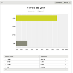
After finishing our first draft for our digipak myself and grace created a questionnaire and gave it out to people along with an image of our digipak, the questionnaires and results are below.
After finishing our first draft for our digipak myself and grace created a questionnaire and gave it out to people along with an image of our digipak, the questionnaires and results are below.


After looking at our audience feedback we learnt that 10/10 people that took the questionnaire thought that the magazine advert and digipak synergised well. We also learnt that 7 people liked the 2nd photo the best where 2 people liked the 1st photo the best and only 1 person preferred the 3rd photo. Everyone that took the questionnaire also said that the digipak fits the genre and looks professional. When asked if there was any improvements we could make to our digipak6 people said that there was no improvements to be made where 4 people said that changes should be made to the font. With comments such as 'Font border should be grey', 'The borders too heavily outlined' and 'The font should be the same as the last one'.