
A2 MEDIA STUDIES
G324
Advanced Portfolio
Candidate Number: 9217
Magzine First Draft & Ideas
For our magazine advert I came up with the idea to creat a split photograph of our perfromer. On one side of her face she would be well made up and looking happy, whereas on the othe side of her face she woud have smudge make up, a bruise on her eye and a glare in her eye like she had been crying. We all decided this was a good idea as our song is called lovers and liars therefore the image would represent the contrast between the two yet would show the plot to our music video which shows the heartbreak of the girl. After looking at our research on magazine adverts we decided that the name of the performer should be placed at the top of the magazine advert in bold capitalised font. We also decided that the name of the song would be positioned at the bottom of the screen in a simialr font with 'lovers' being positioned under the happy image of the girl and the 'liars' positioned under the upset image of the girl. Below are images of our magazine draft that we drew up and also pictures in which we practised our original idea on. These images will help us when we conduct our photshoot as we will be able to work off the first drafts.


28/12/15
30/12/15
Audience Research
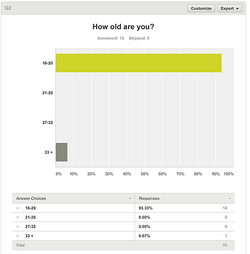
After creating a draft for our magazine advert and discussing all of our initial ideas we decided to use a online survey to get feedback from our audience. The feedback would allow us as a group to address any issues our target audience may feel regarding our advert and allow us to make positive changes to make the advert better and more relatable and intriguing to our audience. Grace created the below questionaire and we then started sharing the web link on social media and asking people we knew to fill it out for us, by doing this it allowed us to reach a larger audience base to give us a varity of opinions.
 |  |
|---|---|
 |  |
 |  |
 |  |
21/01/16
Magazine advert 1st Draft
Originally as a group we began trying to edit the image for our magazine front cover as a split screen between the performers face, however when editing we discovered that this was near impossible to do. From this Milo came up with the idea to blend two images together to create a contrast between the positive image and the negative image. From his suggestion i began editing the two images making sure they where positioned the same and the effct looked professional. After i had edited the image myself and Grace began adding the text and promotional language to the advert to make it look professional. Our first draft is positioned below.

28/01/16
Audience Feedback


From our audience feedback for the magazine advert i learnt that 10/10 people who took our questionnaire said that the superimposition used was effective, some comments stated that it 'showed skill','Fits the title' and 'Very dramatic'. 10/10 people also said that they thought that the make up looked effective, it also made them feel 'Scared', 'Difference', 'Contrast between emotion'. One of the questions we got the most feedback on was on the typography. 5/10 people said they liked the text with comments such as 'Portrays emotion as plain' and it 'stands out'. However 5/10 people said they didnt like the text followed by comments such as 'Too boxey should be flowing', 'Doesnt blend', 'It overrules the imposition' and 'Too bold'. Due to this feed back as a group we will look into changing the typography to something our audience will like. From question 5 we learnt that everyone that took our questionnaire thought the lighting and positioning of the advert looked effective. Finally we asked our audience for suggestions on how to make our advert better, 5 out of the 10 people said they had nothing to change, where the other 5 people said they would make changes, after analysing their comments i learnt that the only thing they would change was the typography.
1/02/16
Further Audience Feedback
From our questionnaires we learnt that the majority of our target audience did not like the typography displayed on our magazine advert and on the front of our digipak cover. Therefore we decided to conduct a focus group where we asked 5 people their opinions on the text and gave them a list of texts in which we wanted them to choose which one they liked the best and thought would appropriately fit our magazine advert and digipak cover. We asked 3 girls and two boys. The people featured in this video are: Vanessa, Bilie, Shelby, Josh and Tom. Below is a video of our focus group along with the handout we gave each of the volunteers and a list of the questions we asked the group.

